On Defining Colours for a Dark Mode User Interface
Generally I very aggressively shy away from working on a design system. Mostly what small to medium large scale and even large scale projects need can be easily covered by what already exists. But there are times when you need to tightgten your belt and get down and dirty with it. This was one of these times. Here I share my process of how I picked the colour system for the UI of this tool I am working on.
 Suryanshu Rai
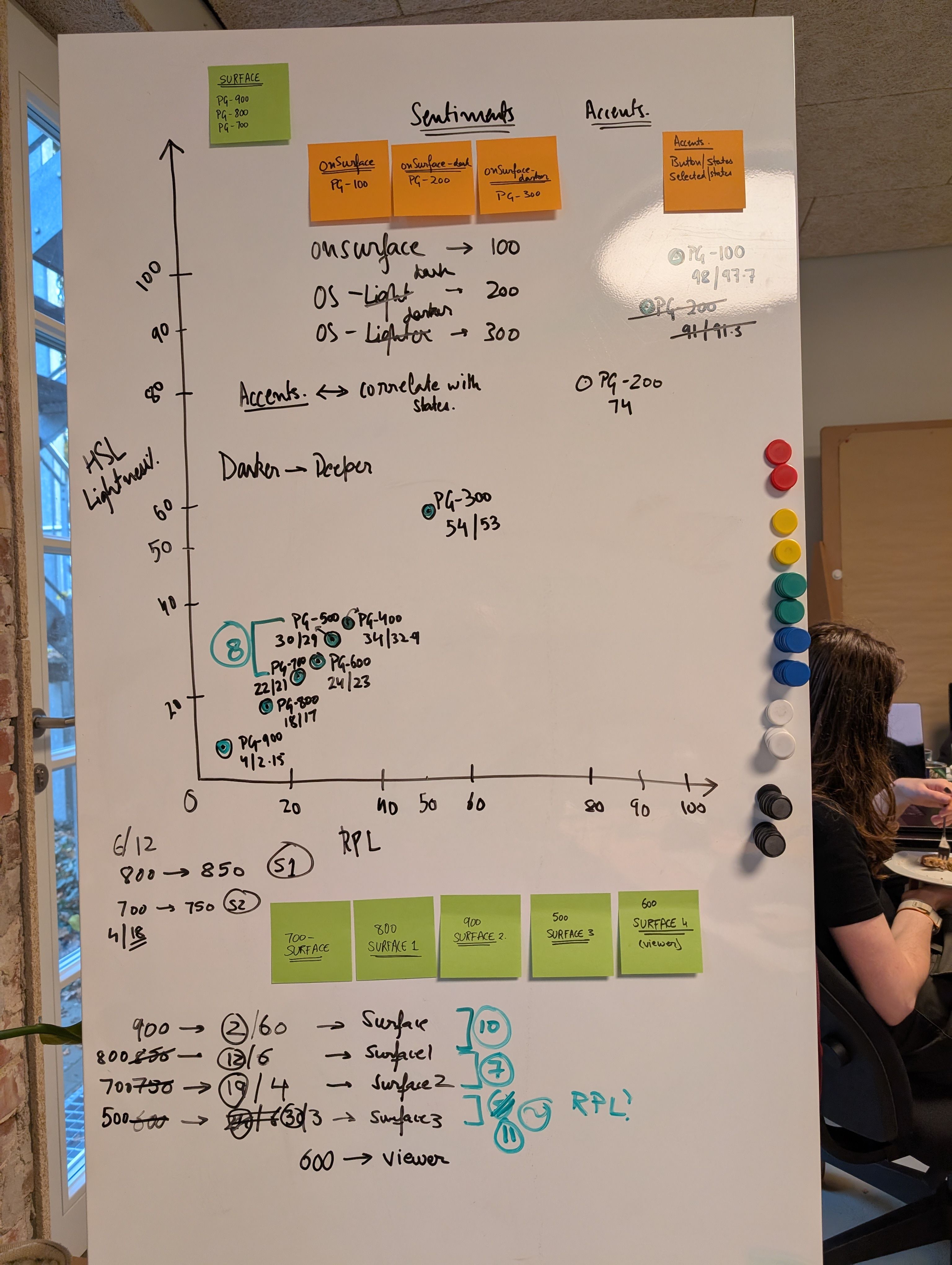
Normally, even though I find it very interesting, I shy away from getting into the nitty gritties of defining colours for a project. Of course, I would from time to time implement some brand colours into the design system, but I avaoid going into doing the sentiment colours and the neutrals.
If I am working on something that needs a system from scratch I would pick up something like tailwind colours as my starting point. Or material or Ant. People have spent months coming pup with these and they have been tested in every possible way and proven to work. So why spend my time making something that would be only half as good.
Well this time it was different. I am working on an engineering tool for a large corporation and this needed it's own set of greays at least. FOr the POC stage I got away with just copying the coouring scheme of Figma dark mode, but it was a cluster fuck as we didn't really have the time to put up colour variables. We went quite fast and I was one designer delivering a team of 8-10 developers.
tbc...